EarlyFoods.
Designed for
trust, not conversion.
A founder-led food brand for expecting mothers and young children, growing through Instagram reels. Everyone assumed price was what held parents back. The research said trust.
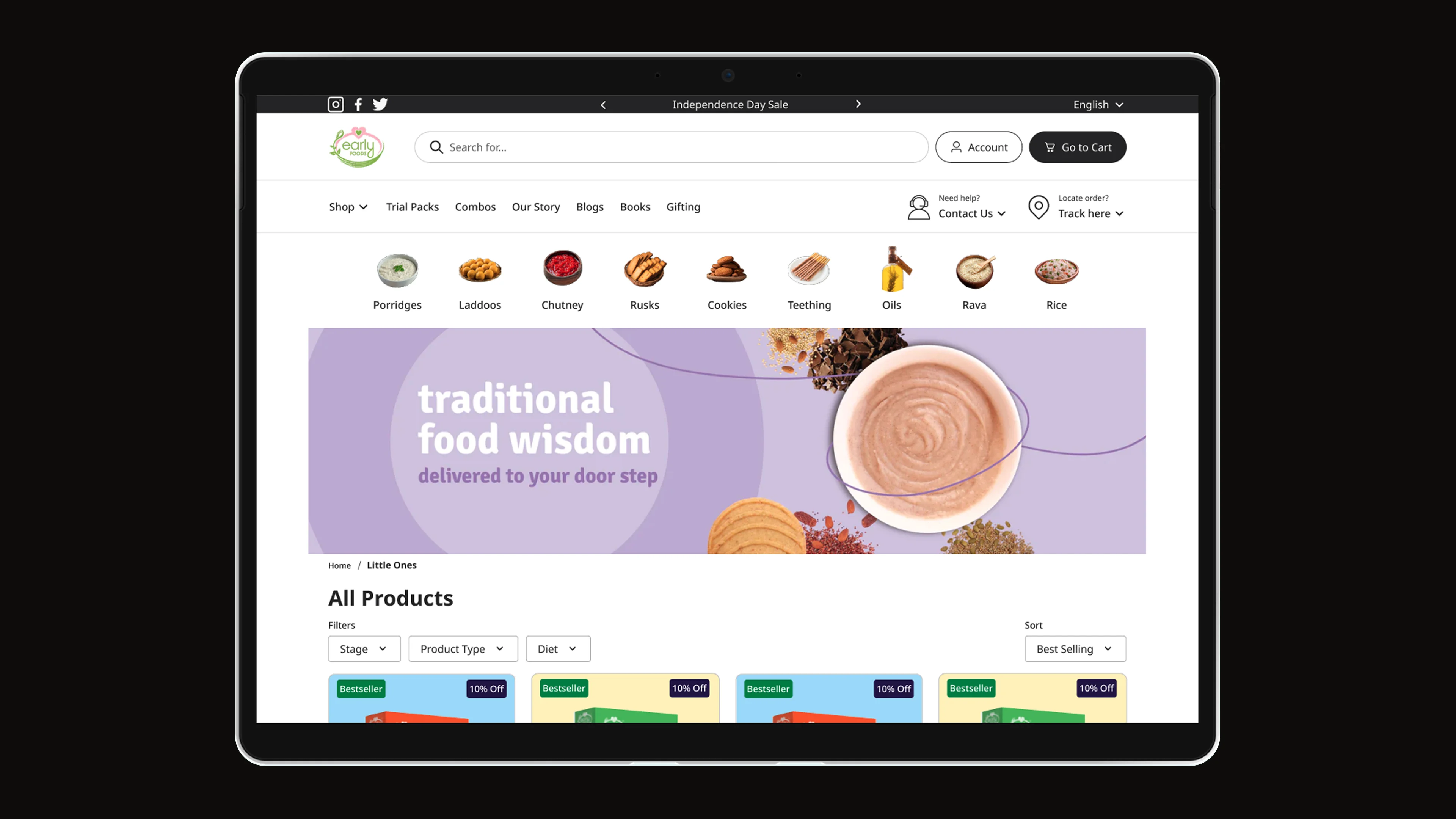
Every food e-commerce site is optimised for sales.
None are designed for trust.
Organic baby food is a category where the buyer and the end user are different people. A parent choosing what their infant eats is not making a convenience decision; it is a safety decision, made repeatedly, under pressure, with imperfect information.
The analytics and the founder both pointed at price: lower it, or discount harder. Heatmaps told a different story. Parents were hunting the page for something before they would commit, and some of the buttons they needed were hard to find. So before changing a single price, we asked them.
"If a parent has to wonder whether this is safe, the design already failed."
Heatmaps, then nearly 400 survey replies. The answer was trust.
Research began with the founder and the store's own analytics, then heatmaps of how parents actually moved through the pages. A survey went to more than 500 customers, and 394 replied. AI helped me find a research report on how parents make buying decisions, which I then read in full. Across all of it the pattern was the same: parents weren't put off by price. They were waiting to feel sure.
The replies showed a consistent pattern: parents wanted certainty before commitment. They read ingredients obsessively, looked for certifications, sought reviews from people like them, and abandoned carts when anything felt ambiguous. The competitor landscape was optimising for conversion, which is precisely the wrong answer for this audience.
Parents read everything
Ingredient lists, certifications, sourcing stories, founder backgrounds. Every detail was scrutinised. Omitting information created distrust; it did not simplify.
The store hid what parents needed
Key buttons were easy to miss, and the age filters made the right food harder to find than it should have been.
Checkout anxiety is real
Parents abandoned carts not because of price, but because of unresolved doubt. Trust signals at checkout, not just at product pages, were critical.
Brand, information architecture, and a trust-first e-commerce system.
The design process covered three interconnected layers: brand identity, information architecture, and the e-commerce UX. All three needed to speak the same language: warmth, transparency, and confidence without arrogance.
The brand system was built around organic and natural motifs: a soft, earthy palette drawn from the actual ingredients (turmeric, spinach, beetroot), with typography that felt approachable rather than clinical. The logo combined a leaf and an early sun: growth, nourishment, first light.
Identity from ingredients
Colour palette derived from actual product ingredients. Typography chosen for warmth over authority. Logo mark combining growth and nourishment.
Trust before discovery
Restructured the IA so that certifications, sourcing information, and founder story appeared before product listings, not buried in footers.
Transparent product pages
Full ingredient breakdowns with explanations, allergen highlights, age guidance, preparation methods, and sourcing provenance on every product page.
Reassurance, then easy reorder
Trust signals placed throughout the checkout flow, not just at cart. Certification badges, quality guarantees, and return policy visible at the moment of payment. Parents who found food they trusted could reorder it easily.
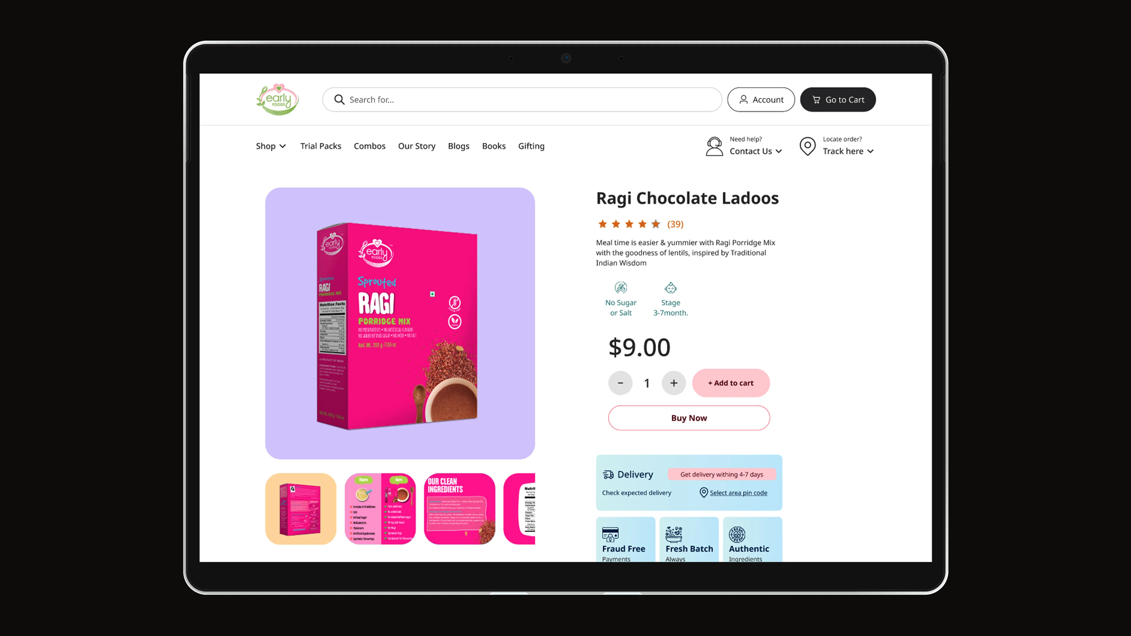
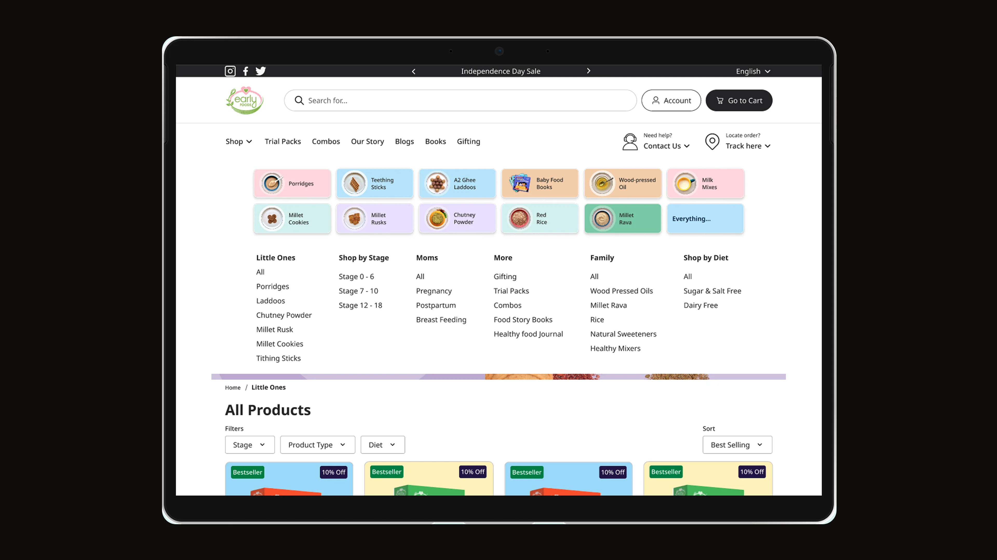
A brand parents trust.
An e-commerce that feels safe to buy from.
Sales rose 33% in a month, and a follow-up survey confirmed why: parents felt sure before they bought. Transparency was not a feature; it was the UX paradigm. Every information gap that caused hesitation in research was addressed by design.
The project demonstrated that emotional UX is not soft; it is precise. Knowing which emotions to design for (safety, confidence, belonging to a community of informed parents) and which to avoid (urgency, scarcity, FOMO) required as much rigour as any conversion optimisation project. The difference: parents came back, not because they were nudged to, but because they felt safe.