EvaluateUs.
Heavy data,
held fairly.
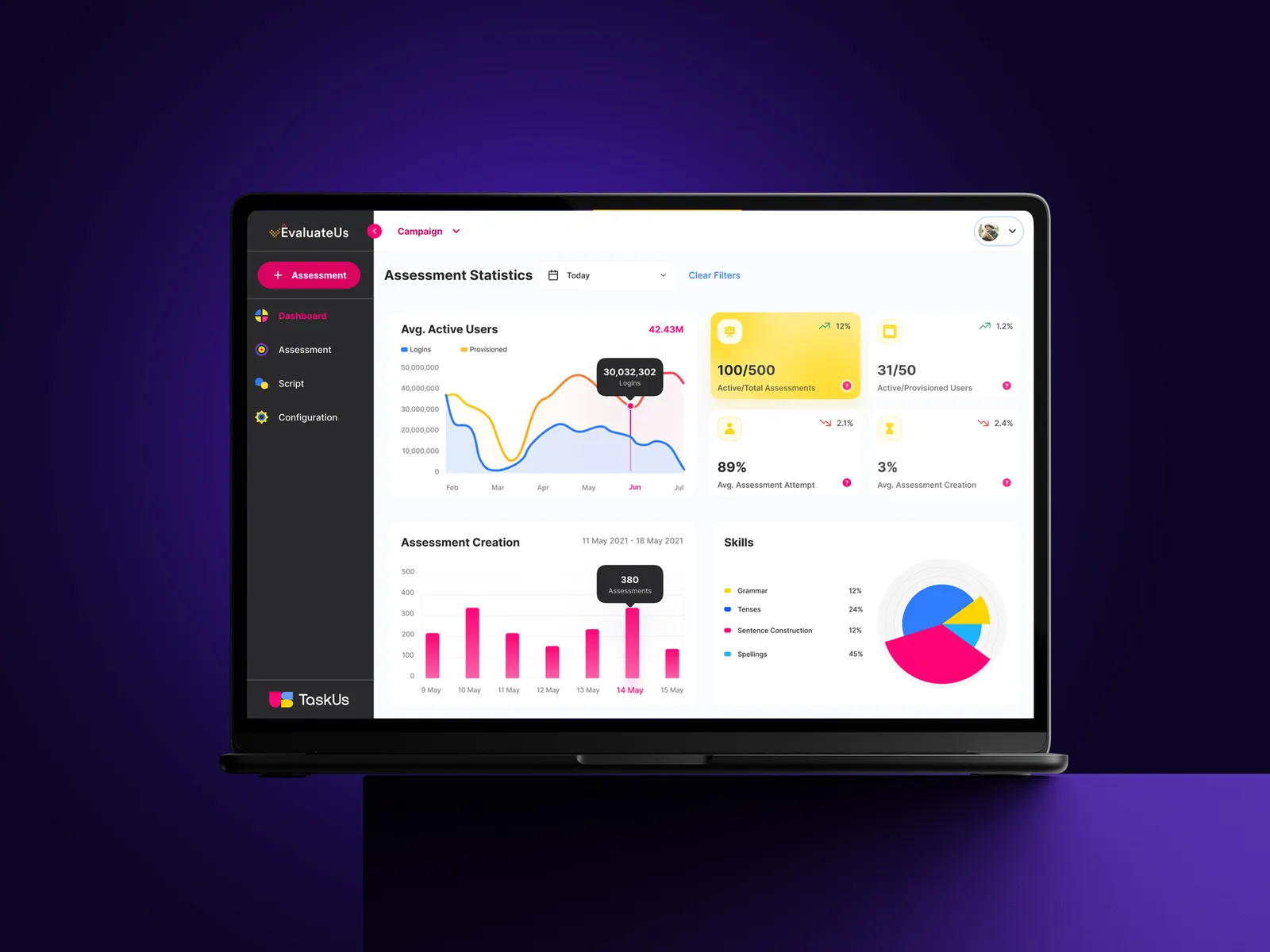
UX strategy and a full redesign of TaskUs's enterprise assessment platform, where an AI scores hiring, coaching and training assessments and people decide what to do next. Accuracy rose 17%, built to WCAG 2.2 AA throughout.
An evaluation is not a data point. It is someone's month.
In high-volume operations, assessment is where the numbers meet people's livelihoods. Evaluators work through dense scoring workflows at speed; the people being evaluated live with the results. When the tool is cluttered or ambiguous, evaluators make errors, and an inaccurate evaluation is not a spreadsheet problem: it is an unfair one. Clients feel it too, because every disputed or re-run evaluation costs real money.
Before EvaluateUs, the picture lived in fragments: several Google Sheets, Boost for coaching, Workday for one-to-ones, and teammate lists sent around by email. Team leads filtered one sheet to decide whom to coach and tracked coaching history in another. Nobody could see how hiring and training were going in one place.
The brief was a full redesign, grounded in UX strategy rather than a visual refresh: make data-heavy evaluation workflows fast to work through, hard to get wrong, and fair to the people on both sides of the score.
"Accuracy is fairness. A mis-scored evaluation is someone's bad month."
Skills built. Assessments run. Results reported.
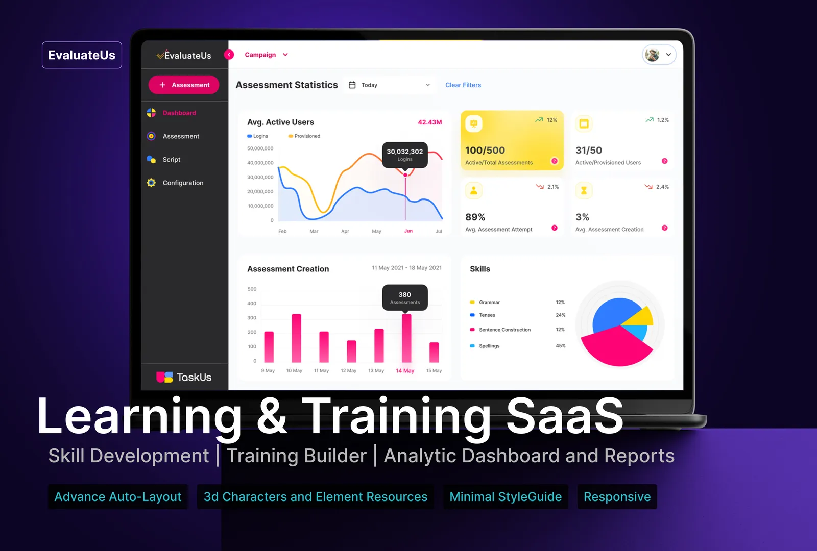
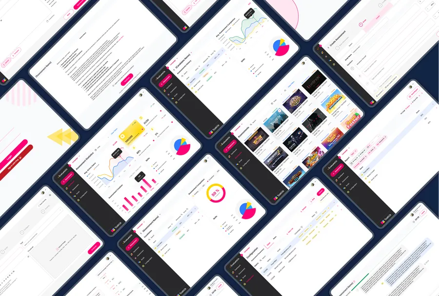
EvaluateUs is a learning and training SaaS as much as an assessment tool. Campaigns and scripts are configured per team, candidates take skill assessments, and managers read the outcomes in analytics dashboards and reports. The surfaces below are production design: configuration tables, the assessment builder, candidate views and the reporting layer.
Design for the decision, not the data.
One AI-scored result, three people reading it. The candidate asks: how did I do? The assessor asks: do I trust this score enough to stand behind it? The manager asks: is this helping my team? The first prototypes made it clear that reporting was the real value, and stakeholders confirmed it. So each view was designed around that person's next decision, not around the data available. An assessment system that only works for the assessor is just surveillance with a UI.
Accessibility was not a checklist at the end. WCAG 2.2 AA contrast, focus states and text scaling were applied throughout, because a tool people are required to use all day has no excuse to exclude anyone.
A system under the surface.
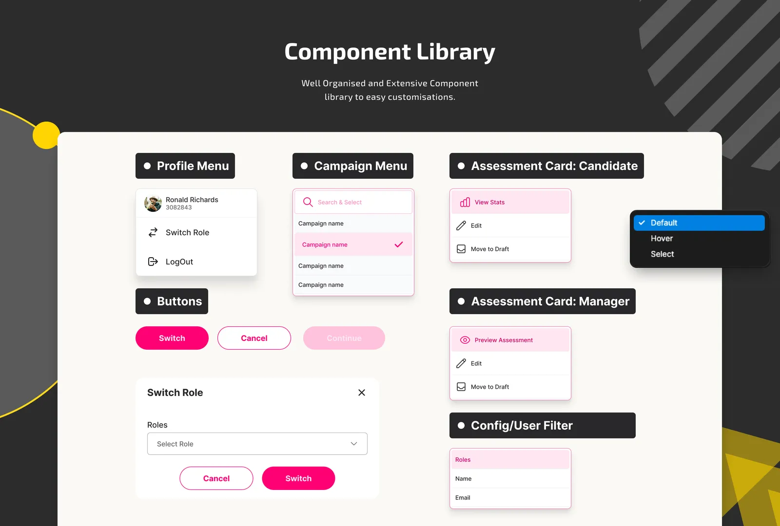
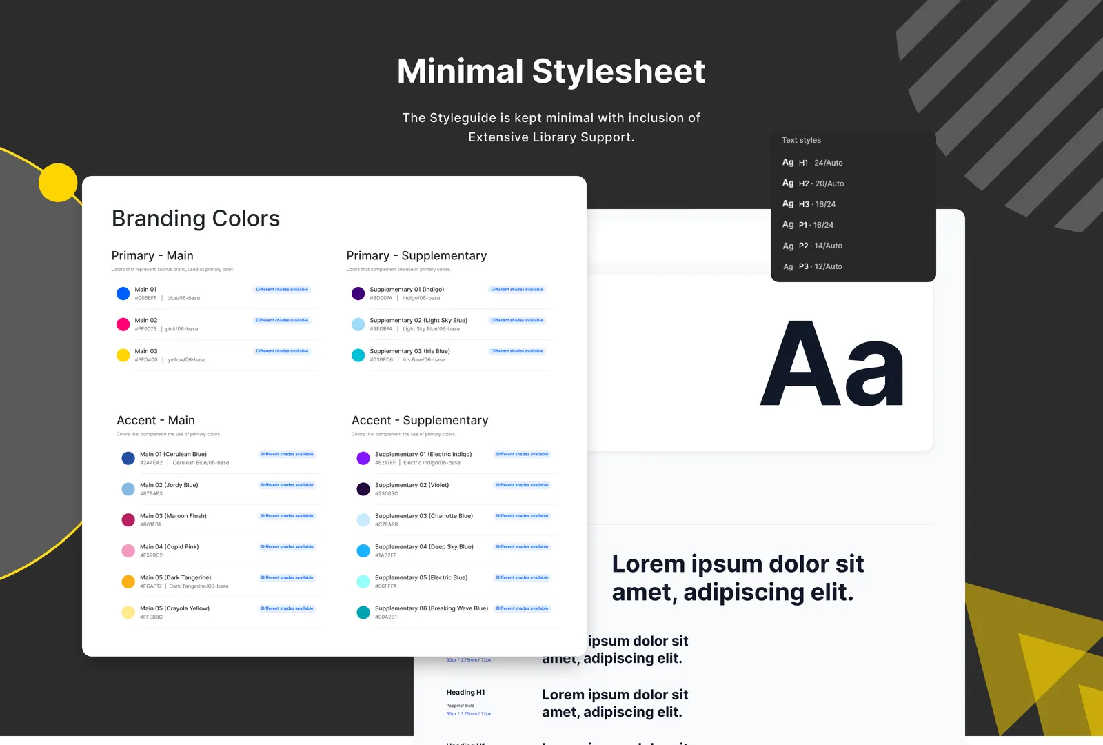
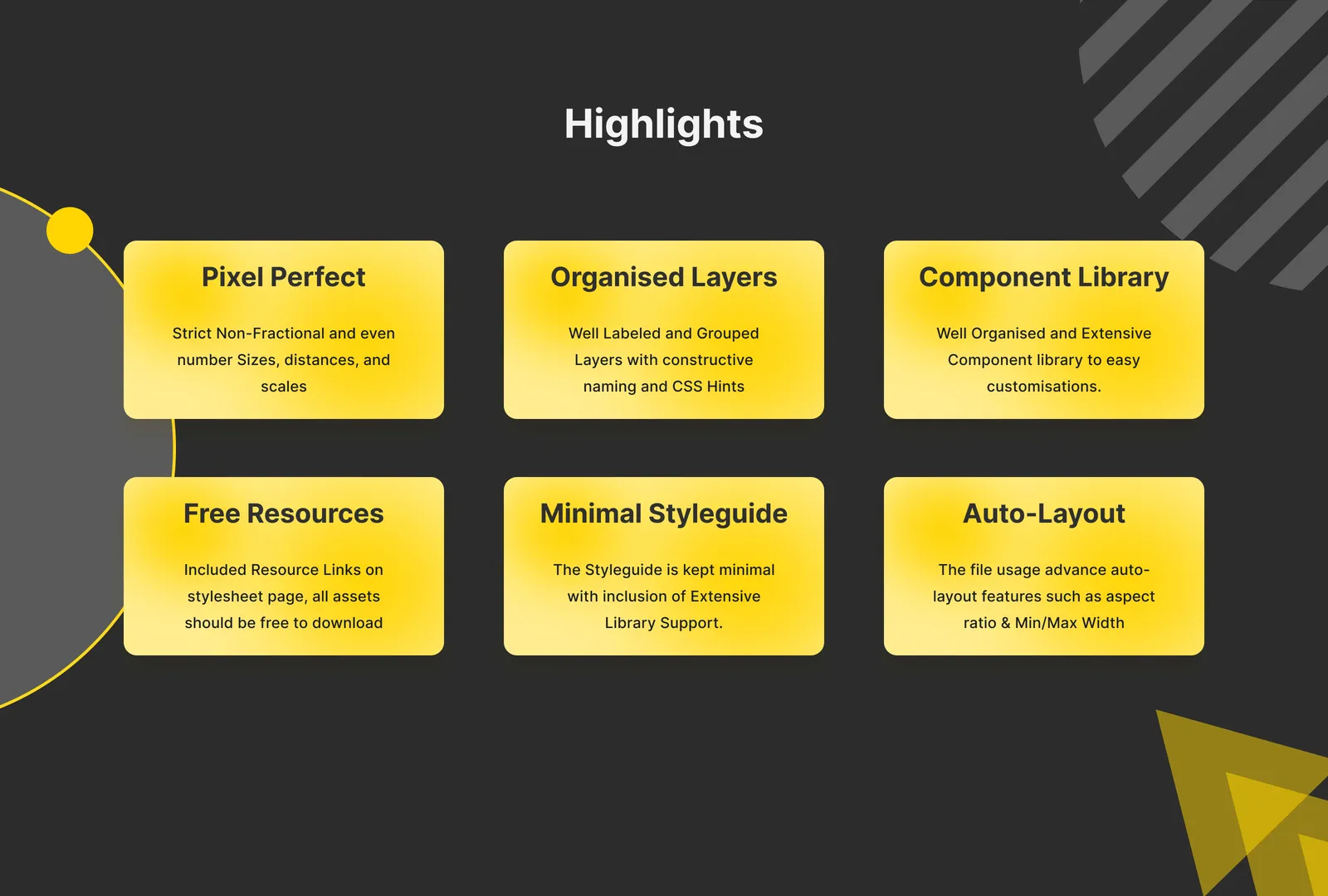
Like every product in the suite, EvaluateUs ships on a design system: an extensive component library, a deliberately minimal styleguide, and a pixel-perfect file with strict non-fractional sizing and advanced auto-layout, so teams can customise without breaking the system.
The full story is told in person.
EvaluateUs is an internal enterprise product protected by NDA. Screens, flows and the detailed decision record are available for discussion in a confidential interview setting: contact@dipeshgurav.com.